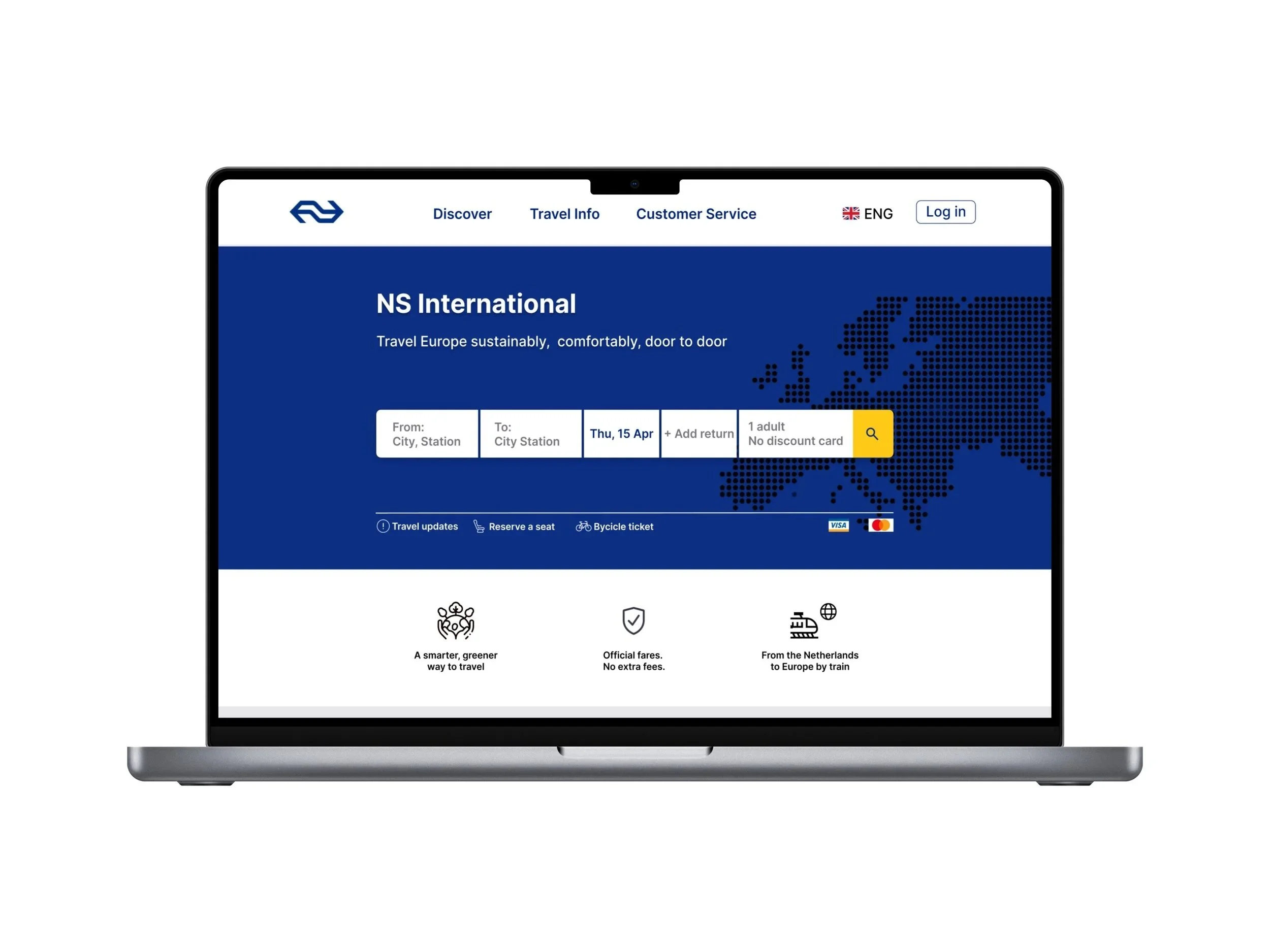
NS International Redesign
Redesigning NS International's booking flow to reduce friction in comparing routes, times, and prices
Team
Duo (Concept & High-fi) /
Solo (Mobile Extension & Polish)
Timeline
4 weeks
Role
UX/UI Designer
Tools
Figma
Problem
NS International's booking flow was not intuitive for occasional travellers, making it difficult to find key information and complete purchases. As a result, users struggled to efficiently find suitable routes and departure times.
Research
0.8
avg. errors in
route selection
Heuristic evaluation
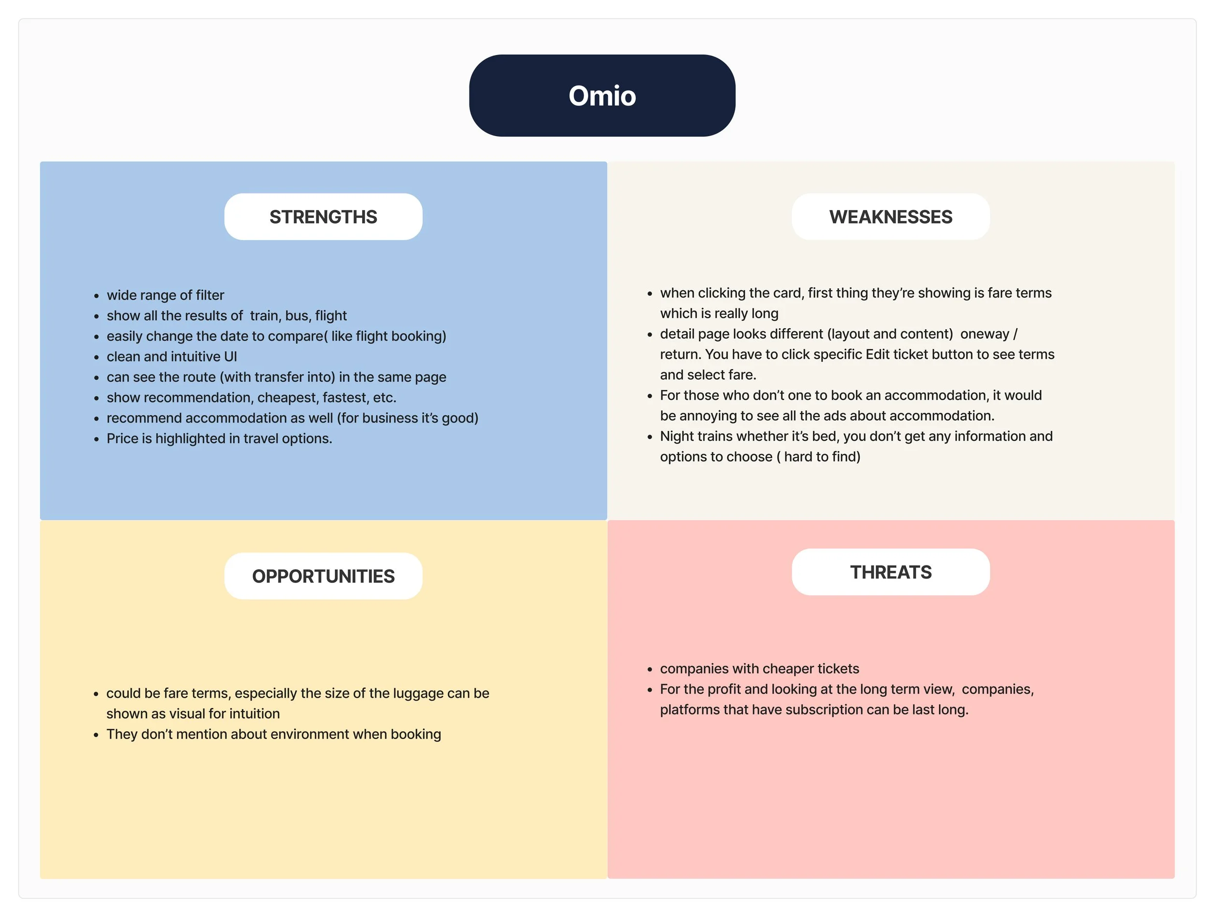
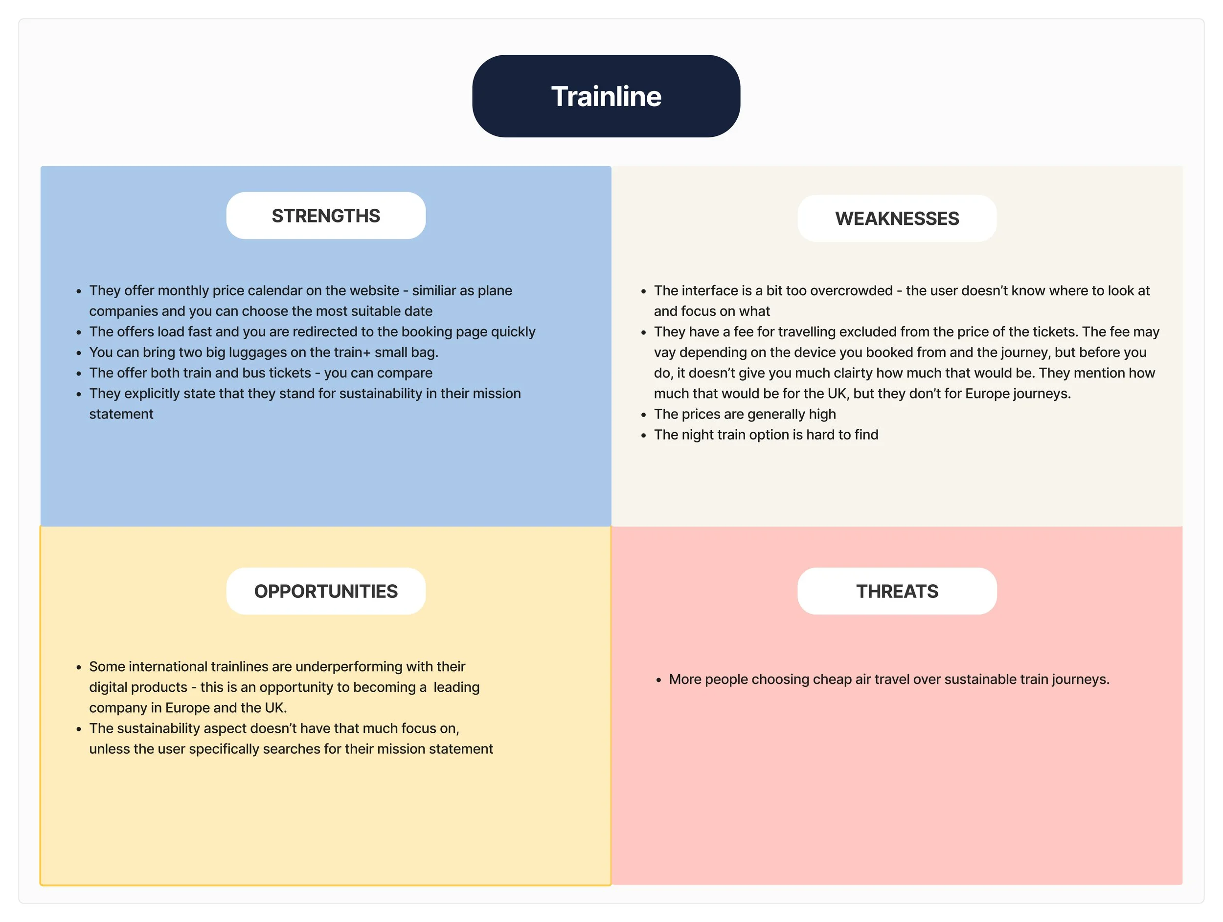
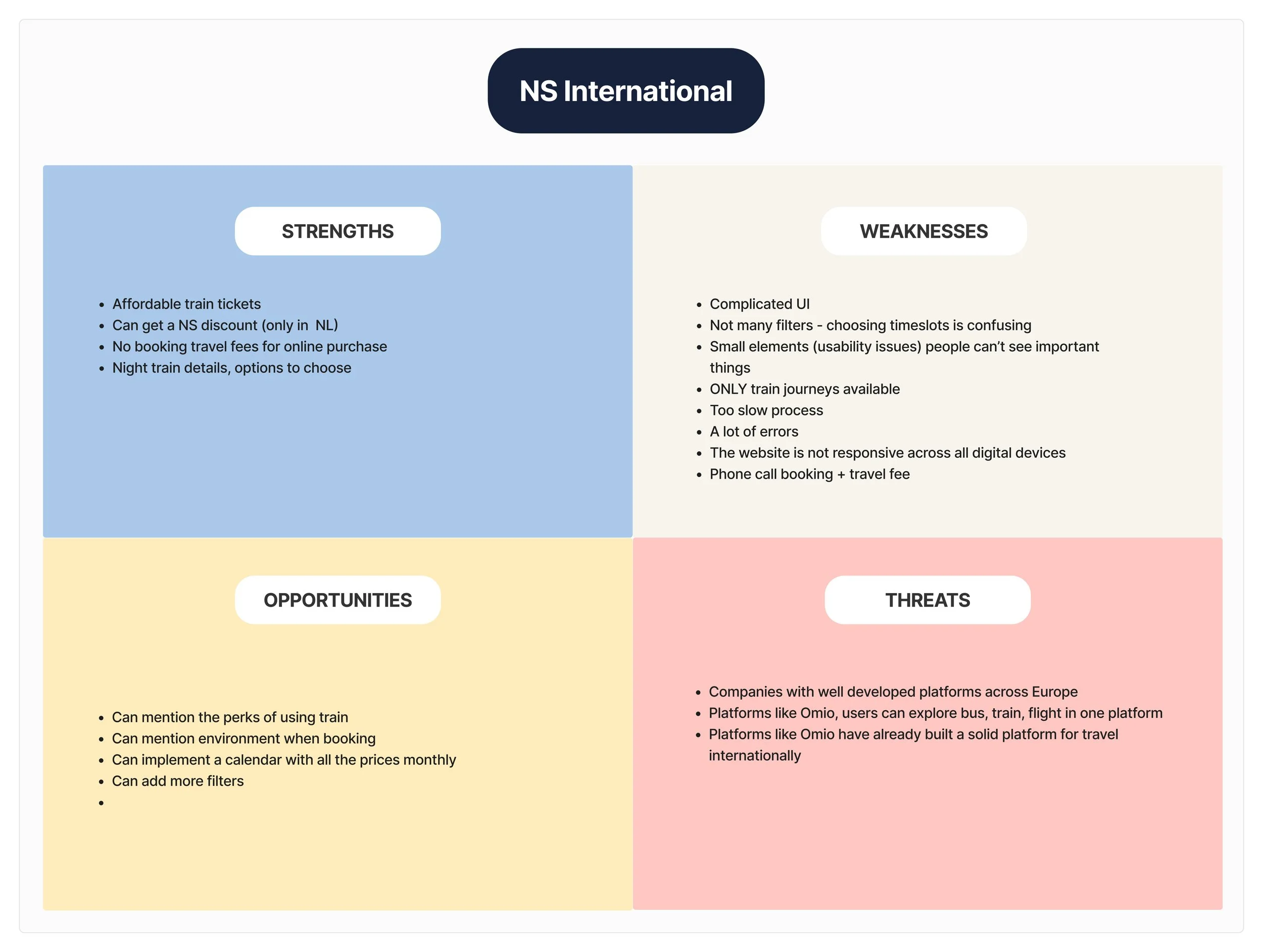
Competitor Analysis
To understand where users experienced friction, we conducted three methods: usability testing, heuristic evaluation, and competitive analysis.
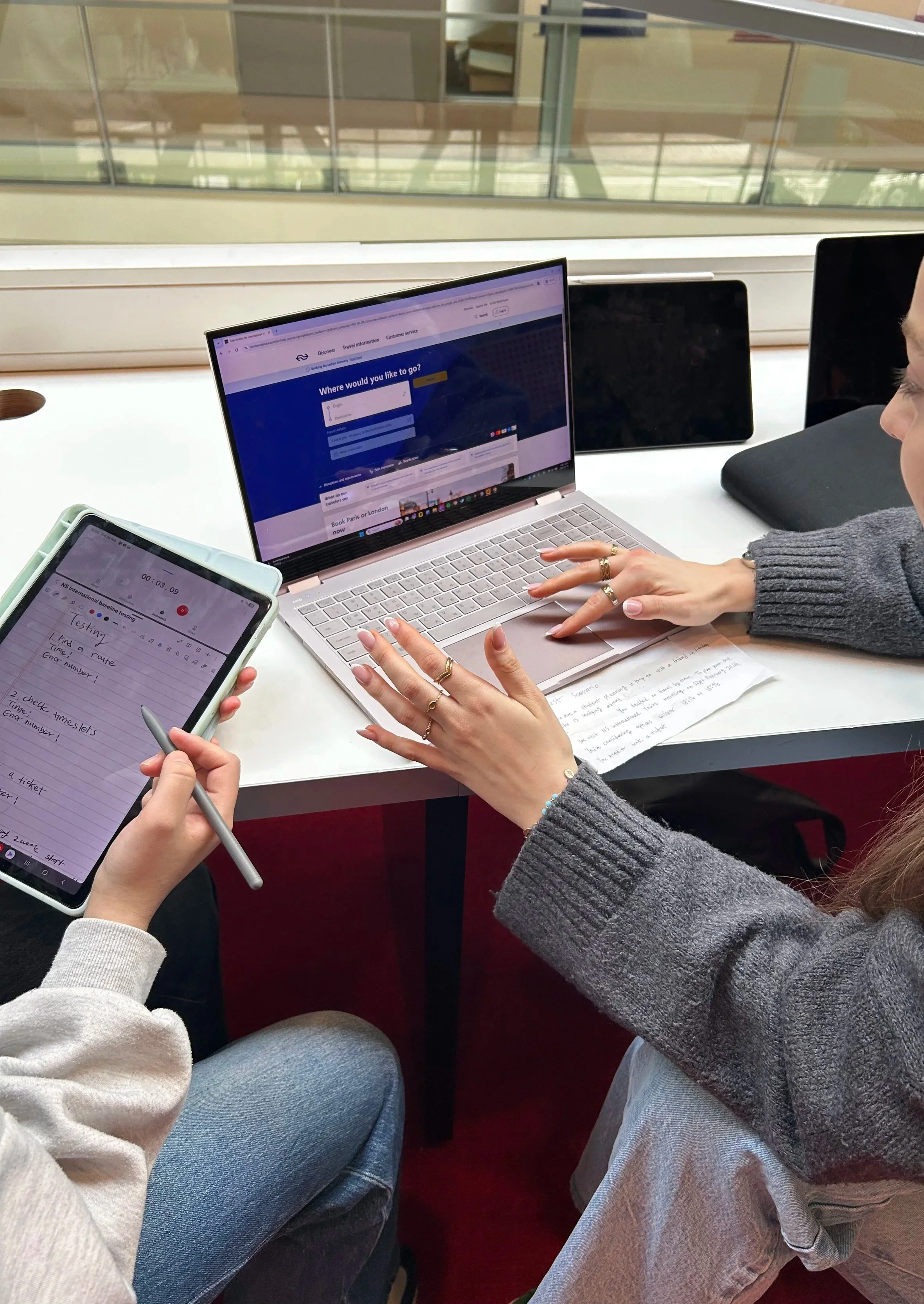
Baseline Testing
I also looked beyond rail booking to flight-booking services to identify patterns in route comparison and filtering (Skyscanner, Google Flights, Ryanair).
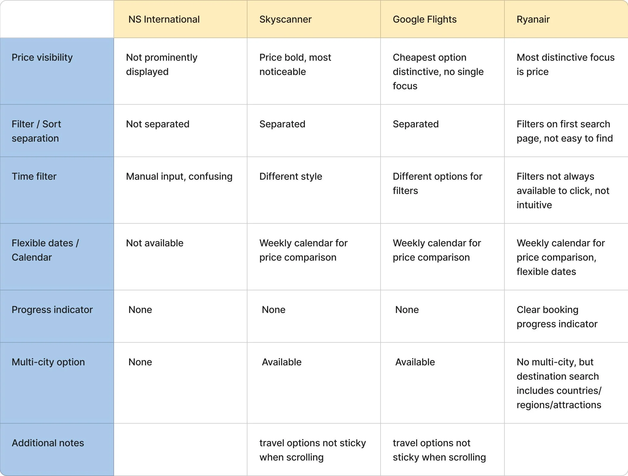
Key pattern
Prominent pricing across all platforms
Filter and sort consistently separated
These findings led us to focus on timeslot clarity, price visibility, and filter/content hierarchy.
We conducted usability testing with 5 users to identify friction points in the booking flow.
60
max time spent selecting timeslot
Key findings:
s
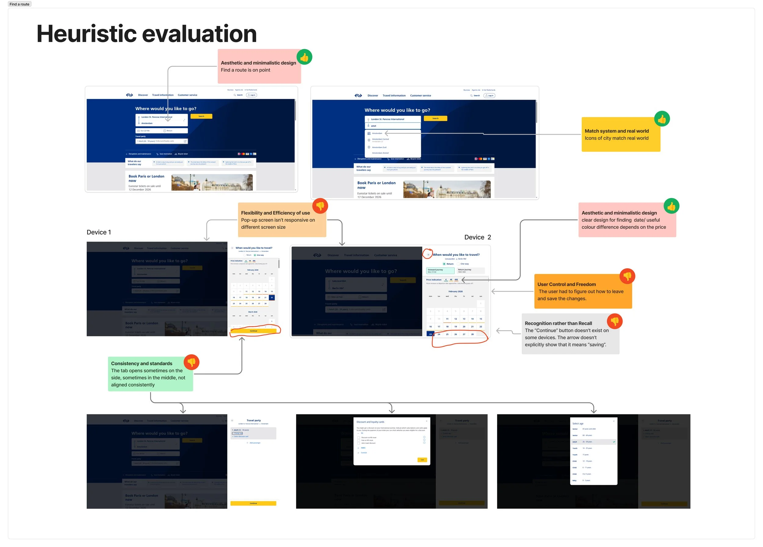
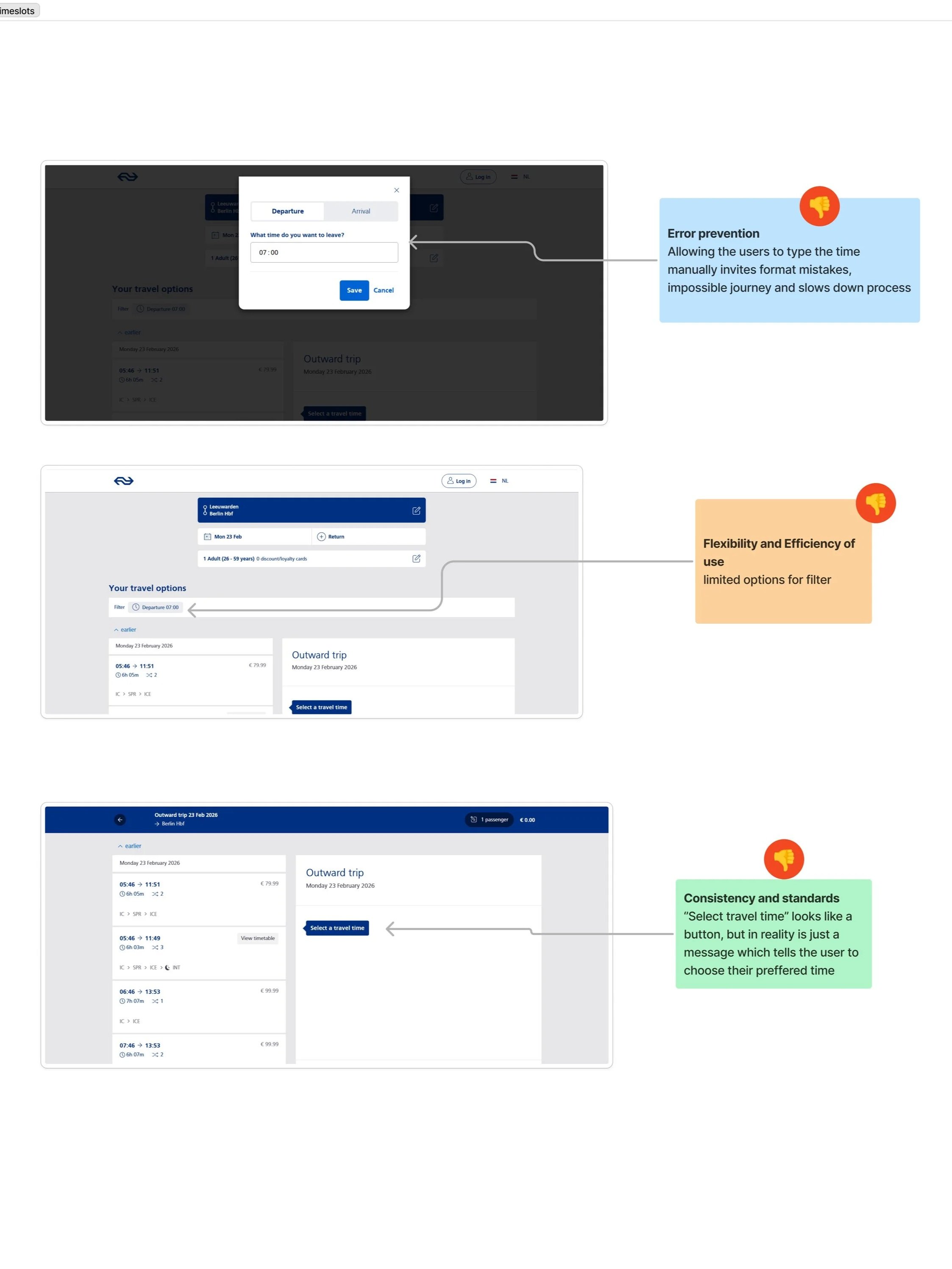
Heuristic evaluation further identified inconsistent tab placement, device-dependent errors in manual time input, and unclear labelling for unavailable journeys.
We conducted Competitor analysis using the SWOT method. A key takeaway was that price comparison and route options should be easy to scan.
7.8
user satisfaction
/10
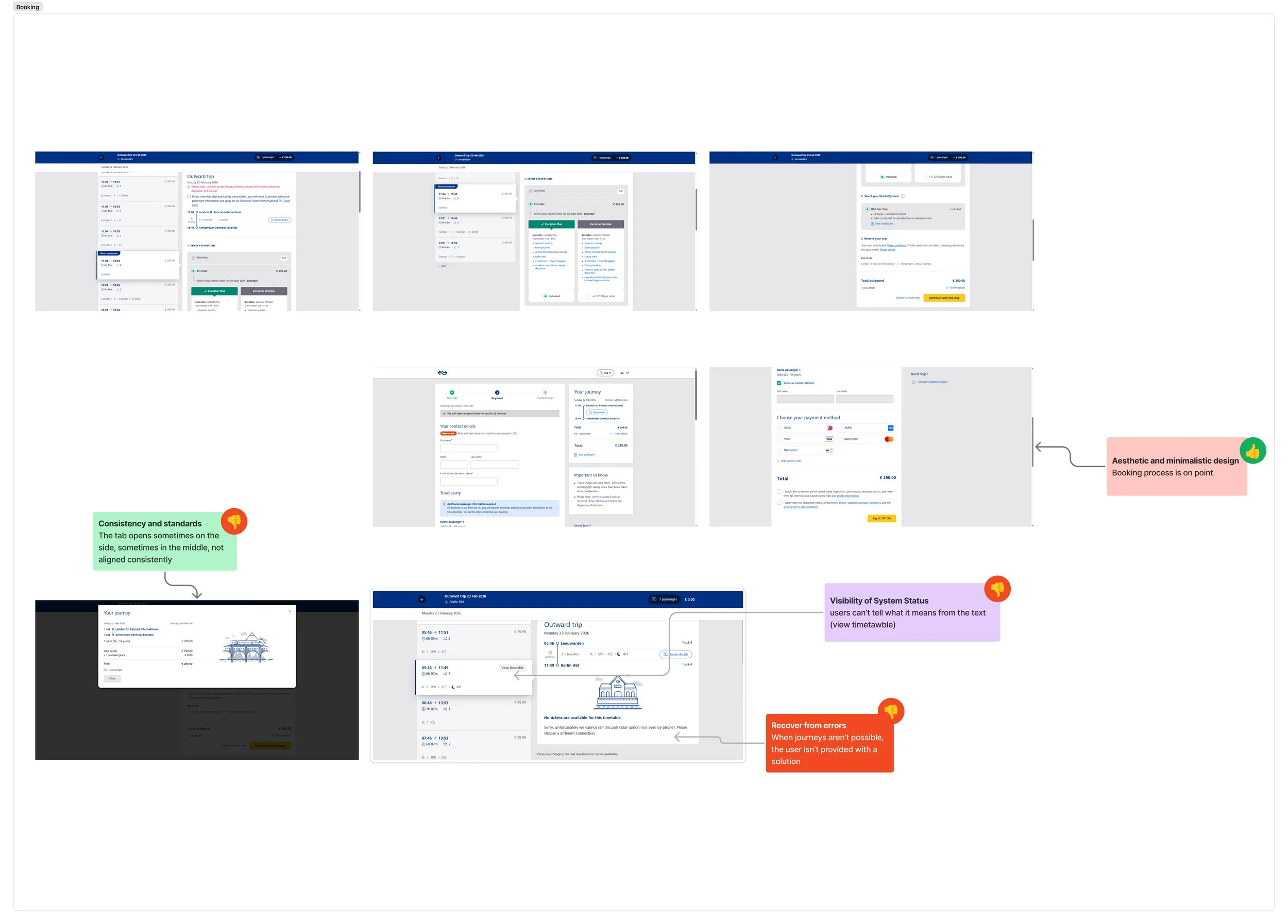
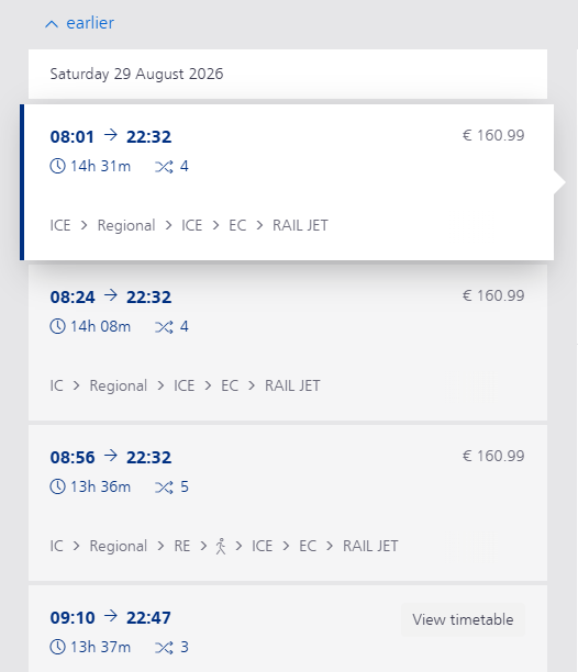
Users also struggled to locate key controls within the booking flow such as the time filter, Earlier/Later buttons, and unavailable journey indicators were difficult to find without prior familiarity with the interface.
Design
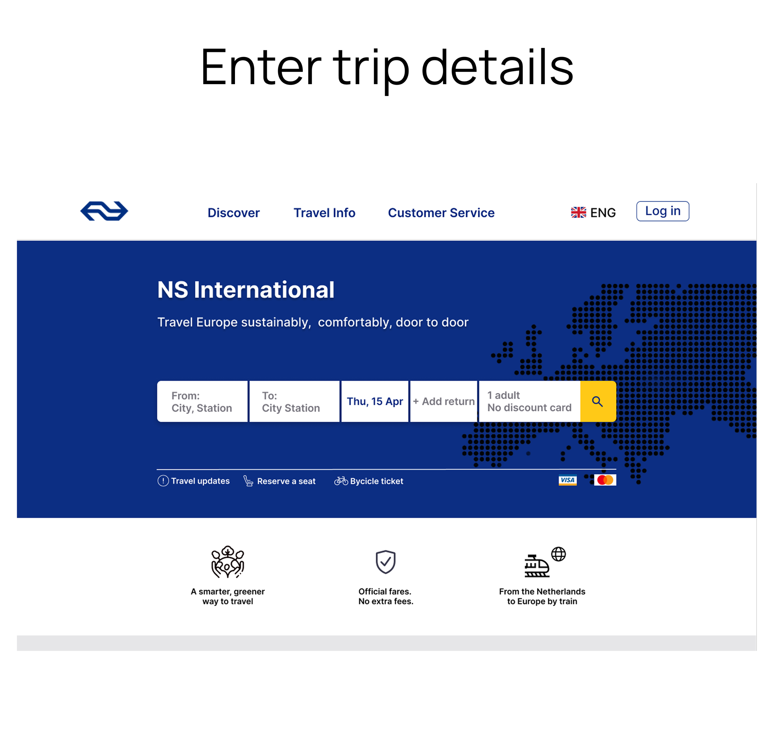
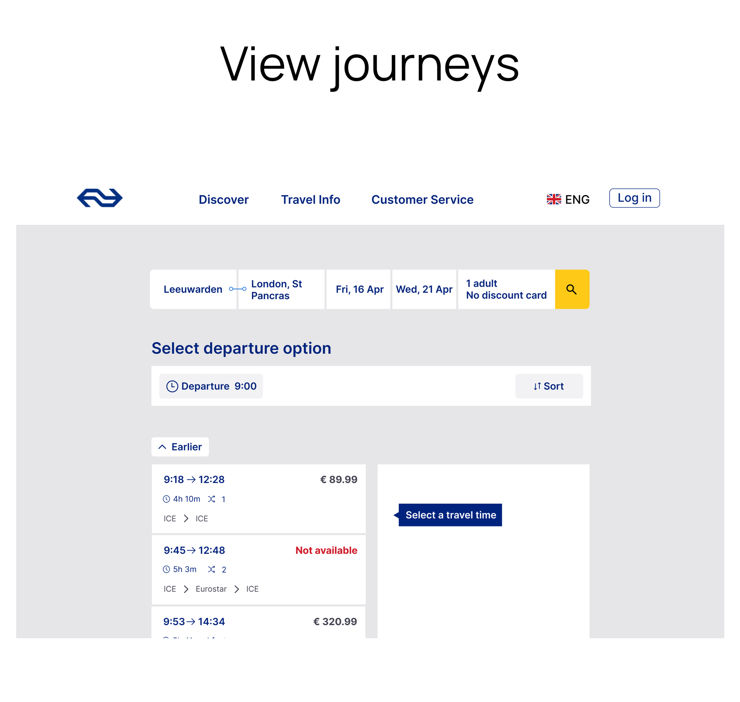
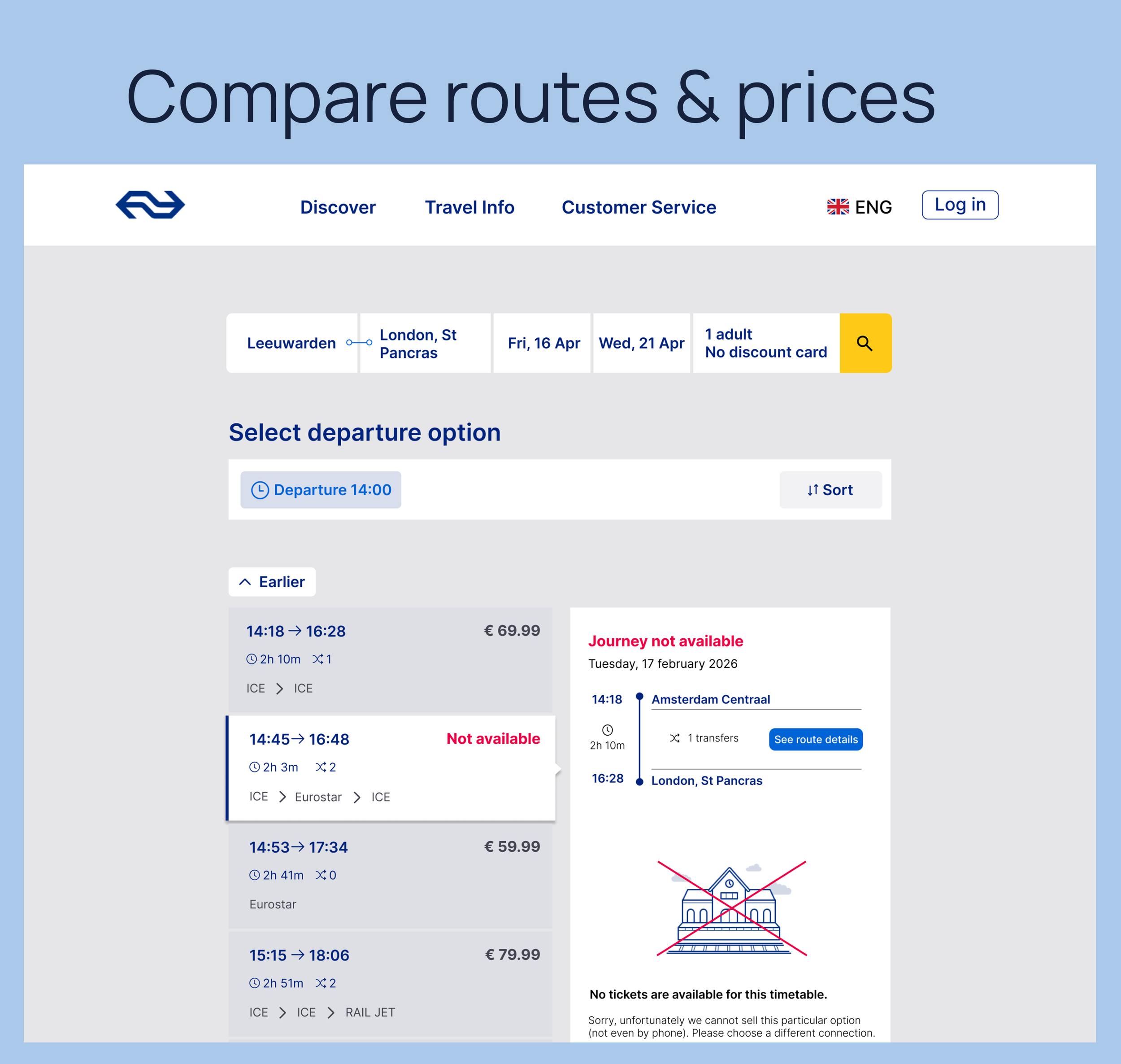
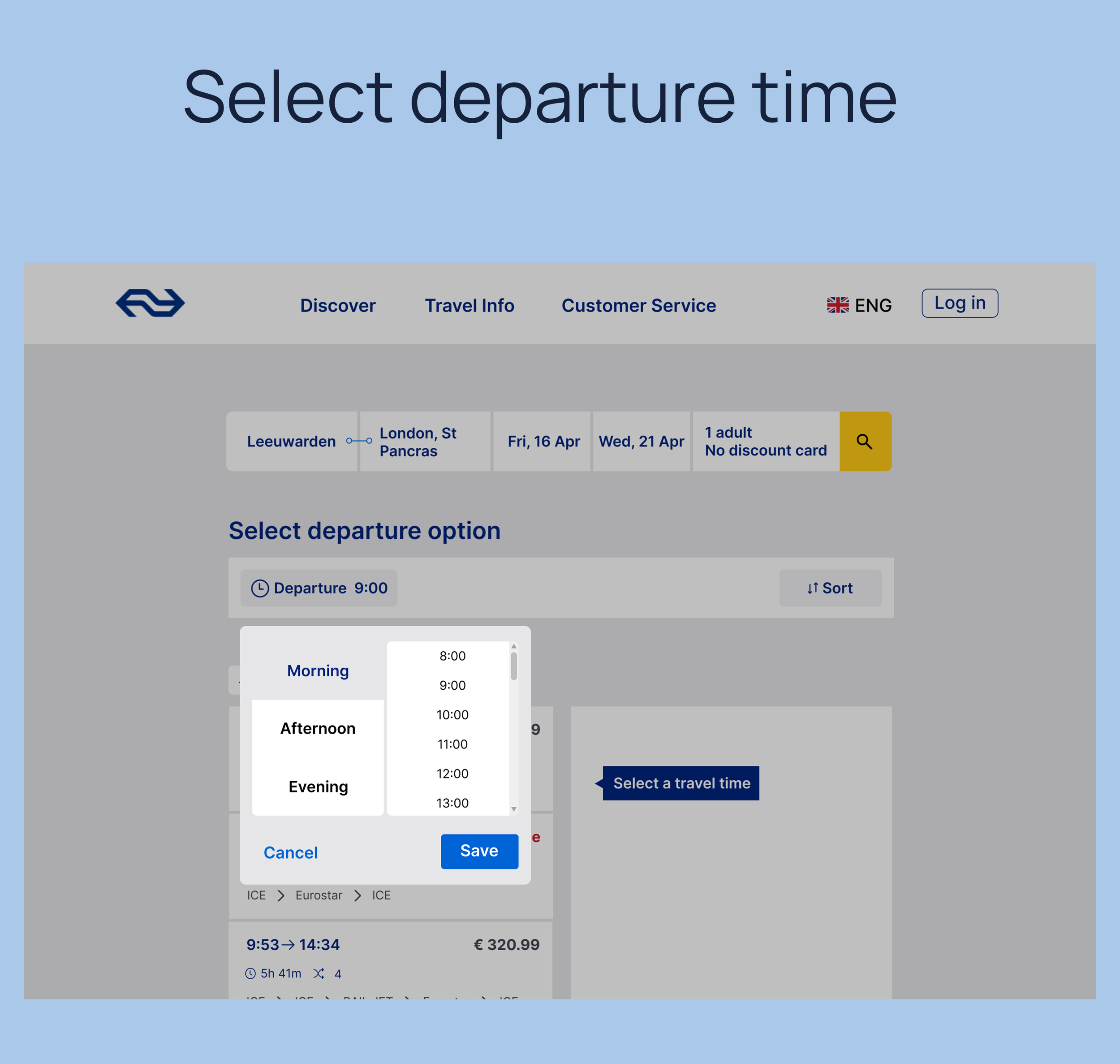
Low-Fidelity
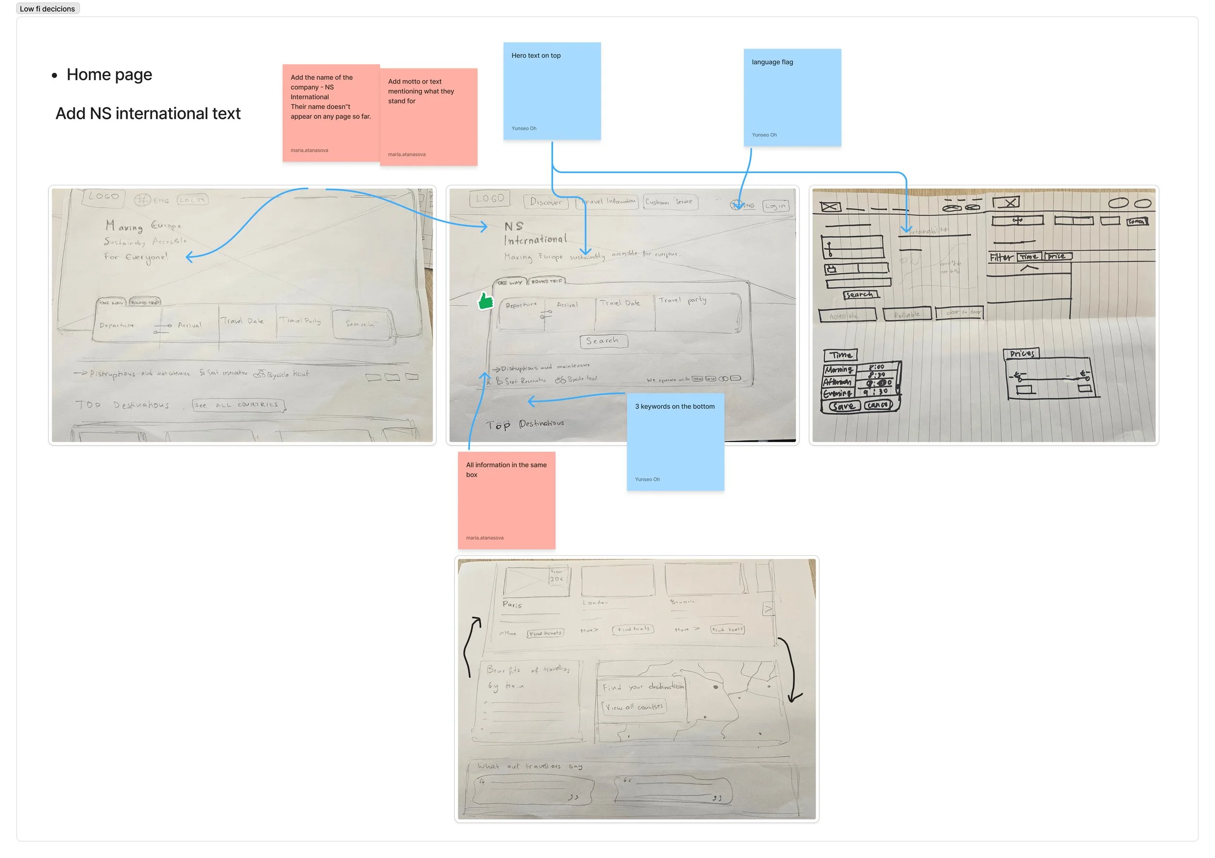
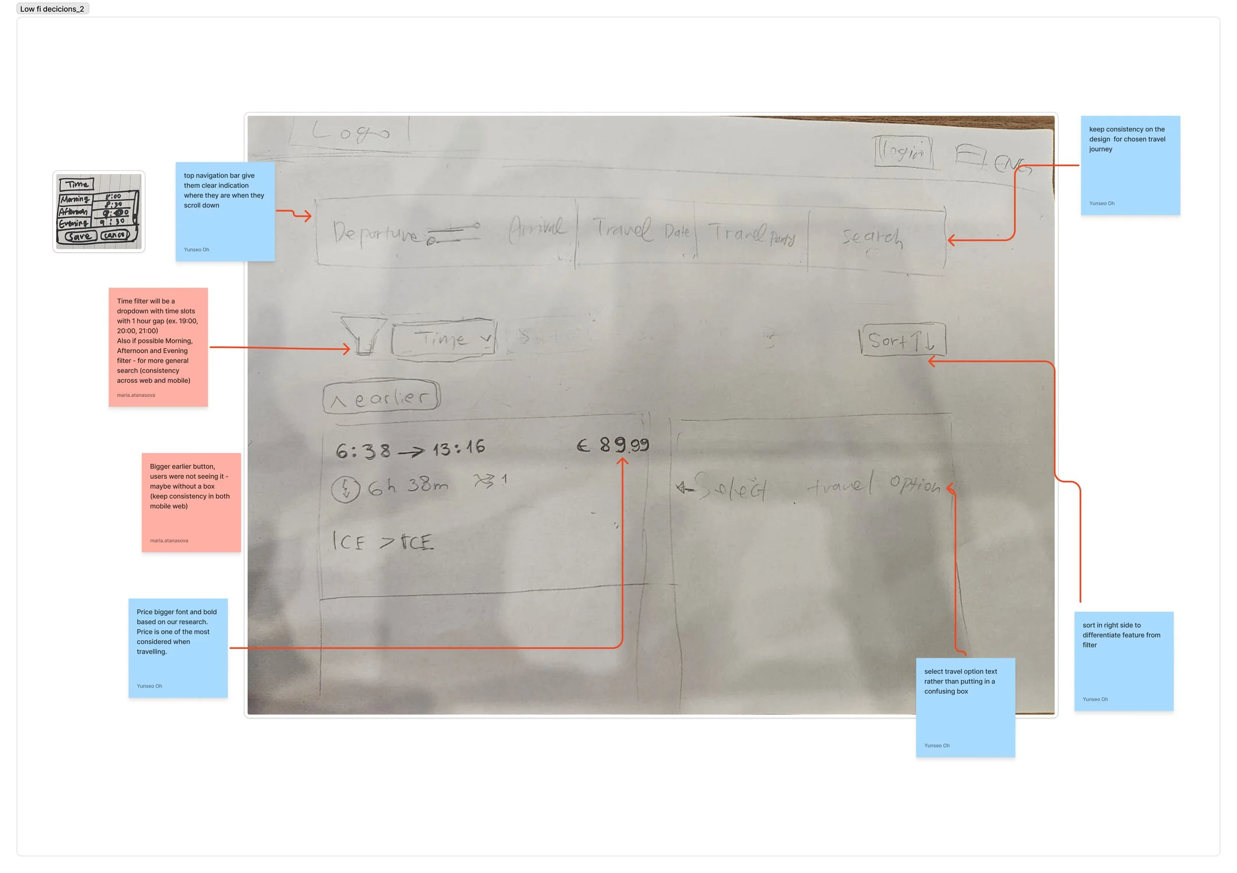
Mid-Fidelity
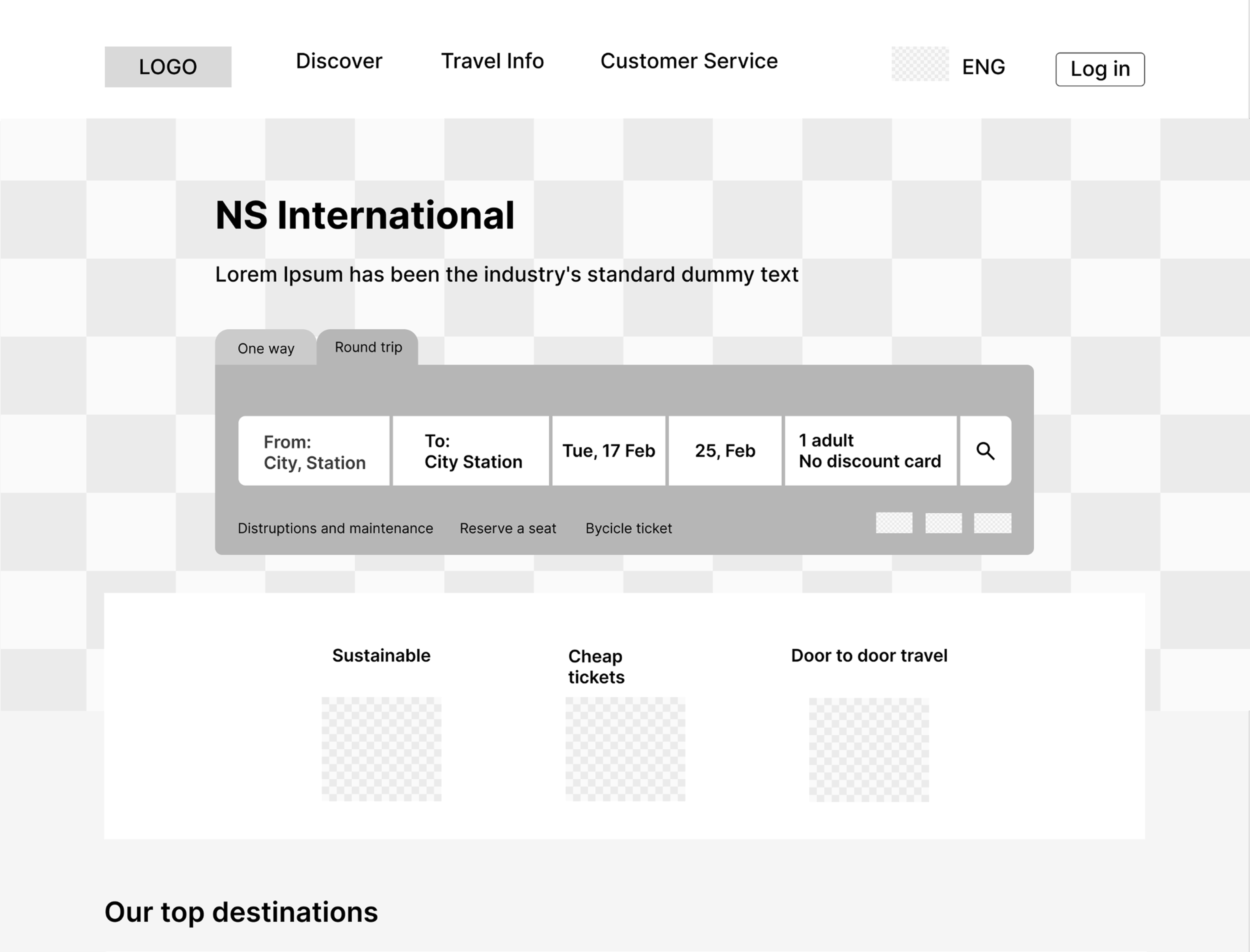
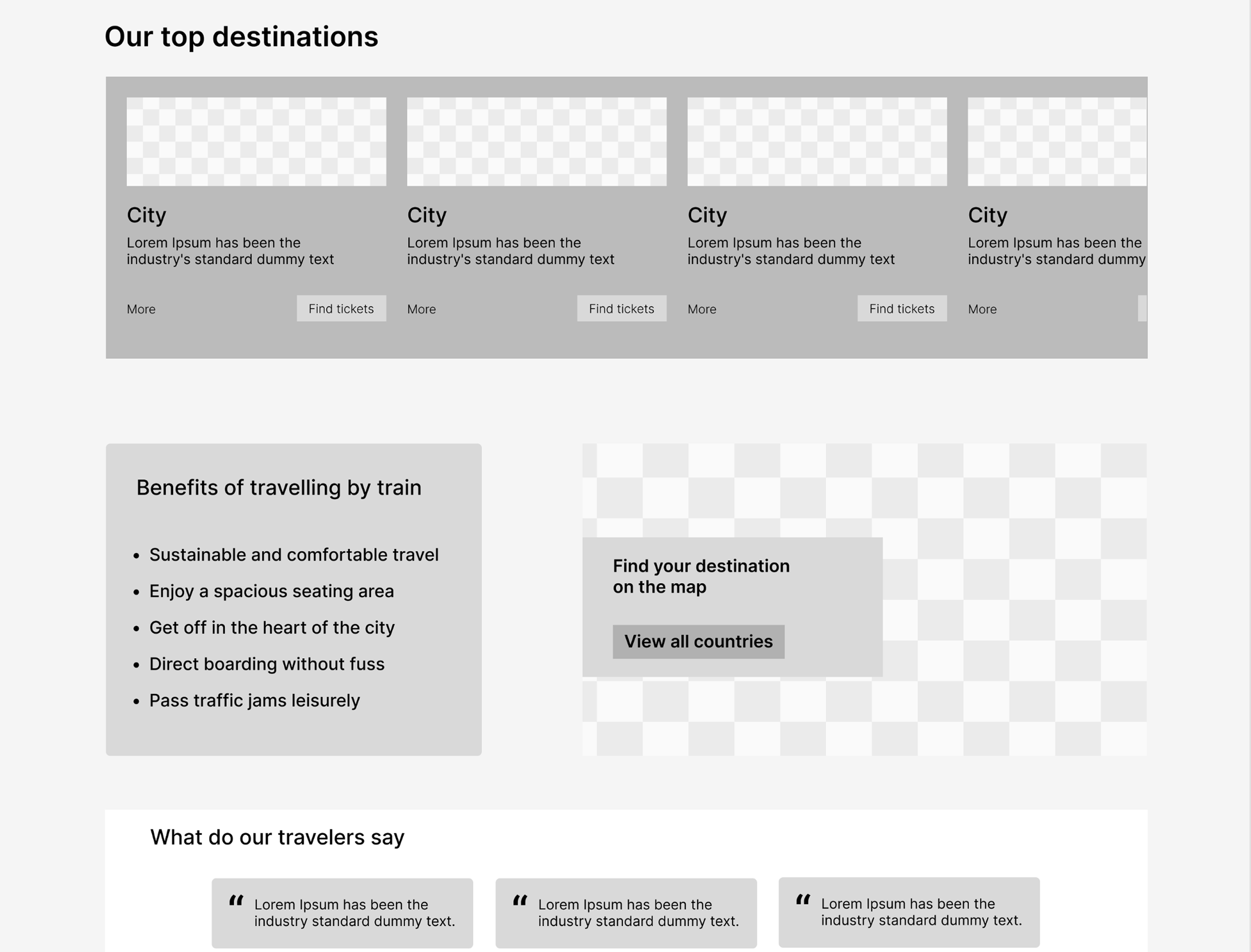
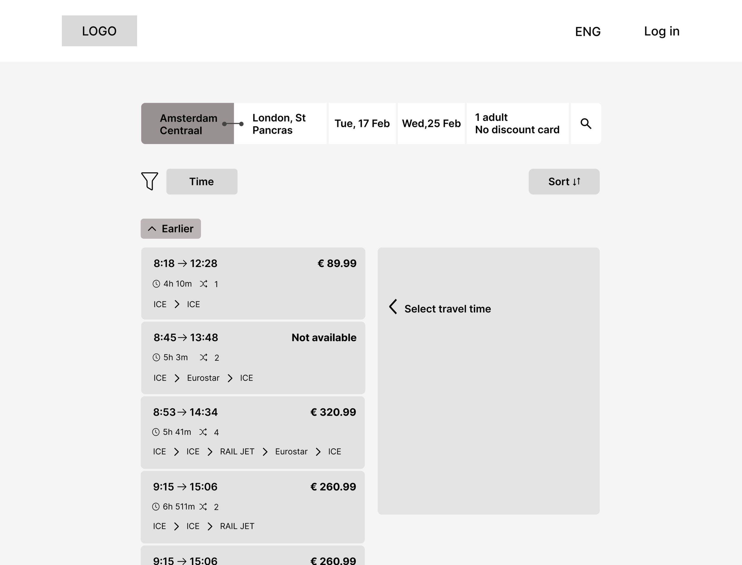
High-Fidelity key design decisions:
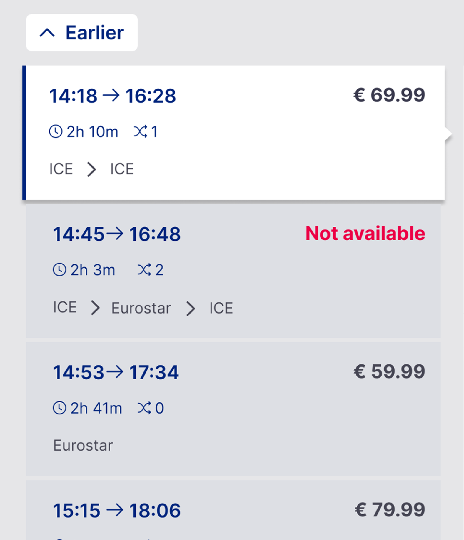
Not available
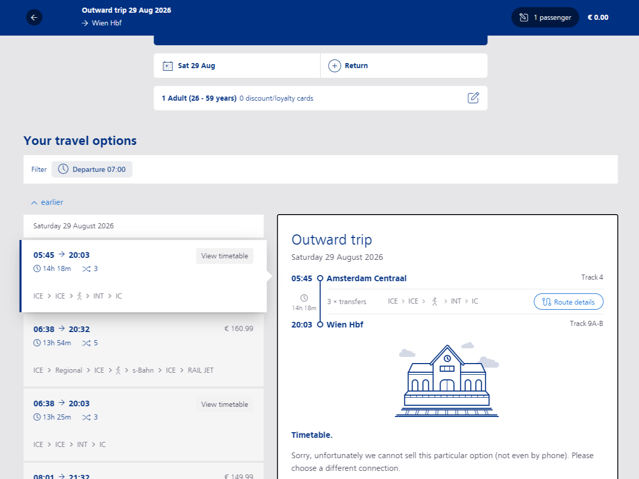
Why: Users had to click to discover unavailability — wasted time and confusion
What: Renamed to "Not available" + red colour indicator
Result: No participant reported difficulty understanding the availability state in final testing.
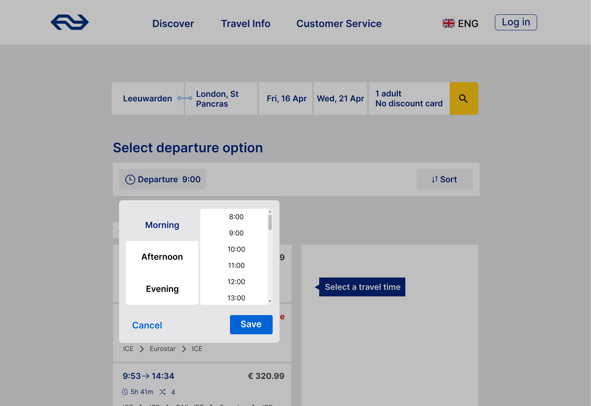
Timeslot
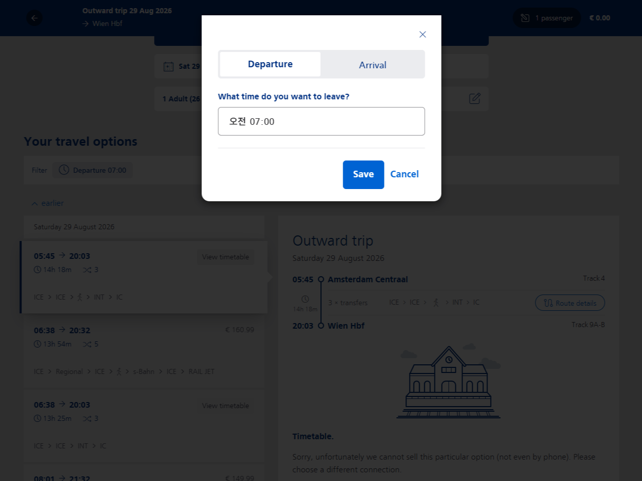
Why: Heuristic evaluation and baseline testing both identified that manual time input caused device-dependent errors, and Earlier/Later buttons were hard to notice .
What: Replaced manual input with preset time slots (scroll-based). Added morning/afternoon/evening options for mobile consistency. Increased Earlier/Later button size and visibility.
Result: The visibility issue did not recur in final testing. However, 5/6 participants still scrolled rather than using the time filters, suggesting that filter discoverability remains an area for iteration.
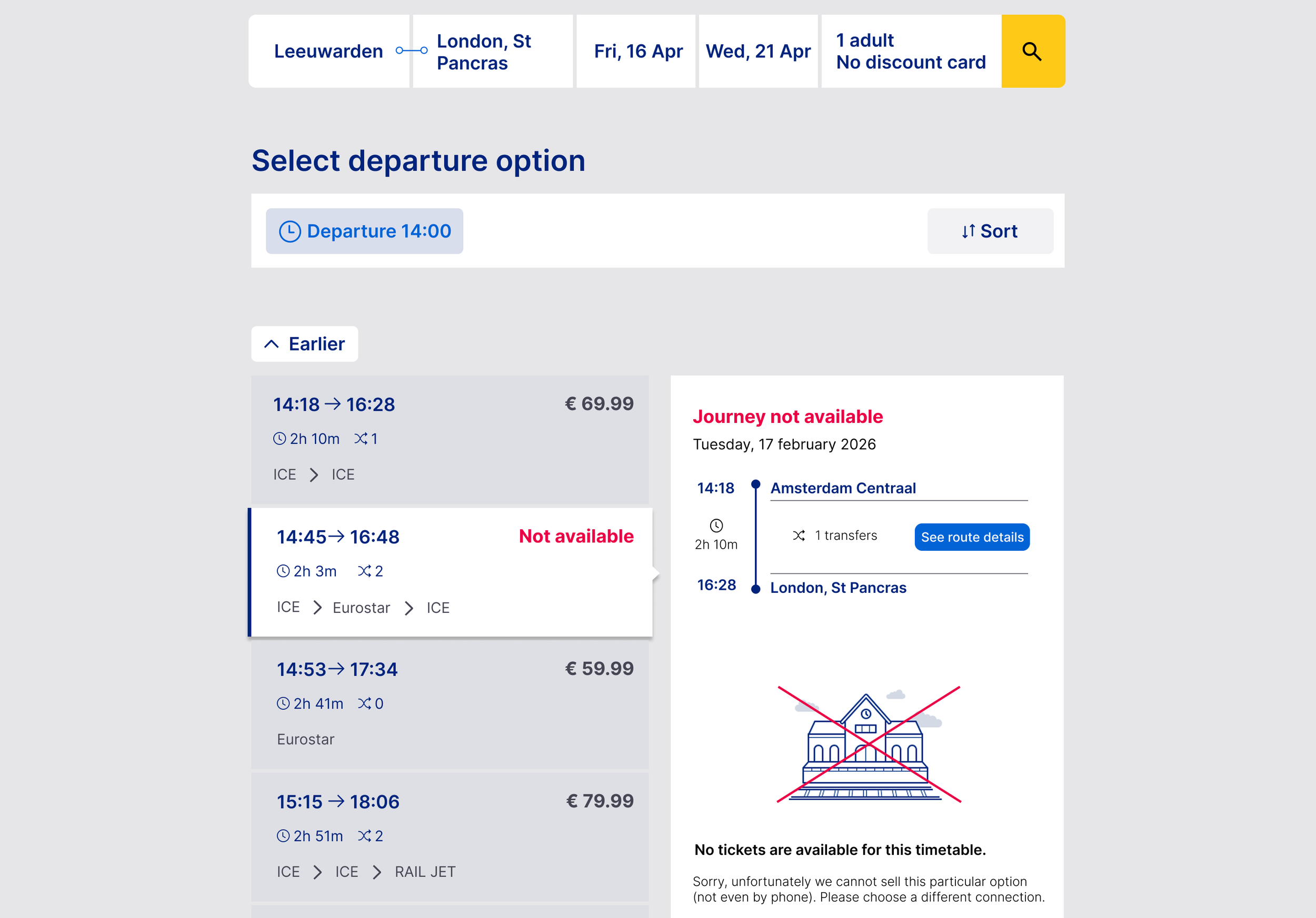
Price Visibility
→
Why: Competitor analysis showed price as a visually prominent element across platforms, while NS International's booking flow lacked clear price hierarchy.
What: Increased price font size and weight to establish visual hierarchy. Added sort functionality to allow users to compare options by price.
Result: In final testing, no participant reported difficulty locating price information. One participant used the sort functionality without prompting.
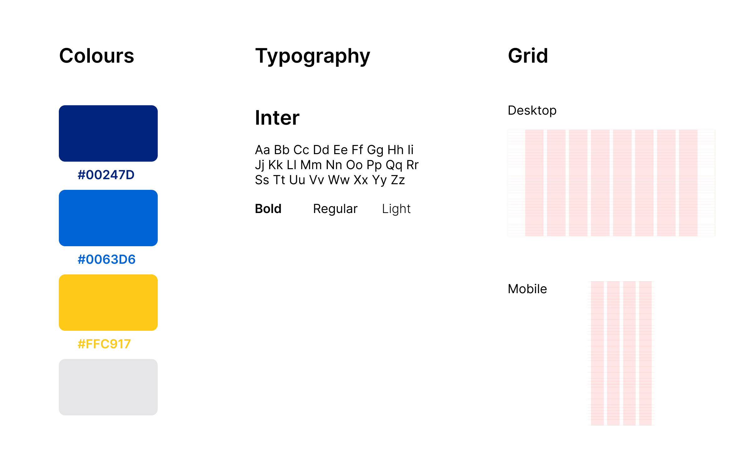
Style Guide
→
→
Testing
Testing was conducted across 3 rounds with 16 participants total, maintaining consistent tasks for baseline comparison.
Framework
Method: Moderated task-based usability testing, think-aloud
Tasks: 3 (find route, check timeslots, book ticket)
Metrics: Time on task, errors, satisfaction rate
Results:
6/6
Task completion
*Final testing (n=6)
(Baseline: n=5, Mid-fi: n=5 Final: n=6)
“Design speaks for itself”
Prototype constraints (limited interactions, preset inputs) mean timing data may not reflect real-world usage. Therefore, qualitative feedback was treated as the primary validation.
24%
faster in Route finding
*prototype testing
“Logical pattern, easy to find everything”
“Clear, easy to navigate”
Overall, the redesign showed improvement in usability, but did not fully resolve all friction points. Route-finding time decreased by 24%, and the Earlier/Later controls were no longer reported as difficult to find in final testing, suggesting improved navigation and control discoverability.
The timeslot filter remained an area for iteration: 5 of 6 participants still scrolled rather than using the filters. This suggests that while some interaction issues were improved, the overall discoverability of the filtering option was not fully resolved. The results therefore support the direction of the redesign, while highlighting areas that require further iteration.
Business consideration
Discussion
The redesign focused on reducing friction during route comparison and ticket booking. In a live product environment, these improvements could be evaluated through booking completion, drop-off rates, and route-selection behaviour.
As this project was evaluated using Figma prototypes, I did not treat the usability results as evidence of direct business impact. Live A/B testing would be needed to determine whether the redesign improves booking completion, drop-off, or other relevant product metrics.
Reflection
Working on this project taught me
Quantitative metrics in prototype testing require more careful interpretation. Timing data was affected by prototype constraints and natural participant variation.
Even when I felt the design was ready, testing always revealed issues I hadn't anticipated. Small details I had overlooked became real friction points during the session.
Working in a duo pushed me to clearly articulate my reasoning. In a larger group, ideas can be overlooked or go unspoken, but as a duo, there was no one else to speak up.
Next step
Improve timeslot filter visibility
Expand scope to other flows
Define measurable success criteria
before future testingA/B testing to validate my design decisions