Digital Detox
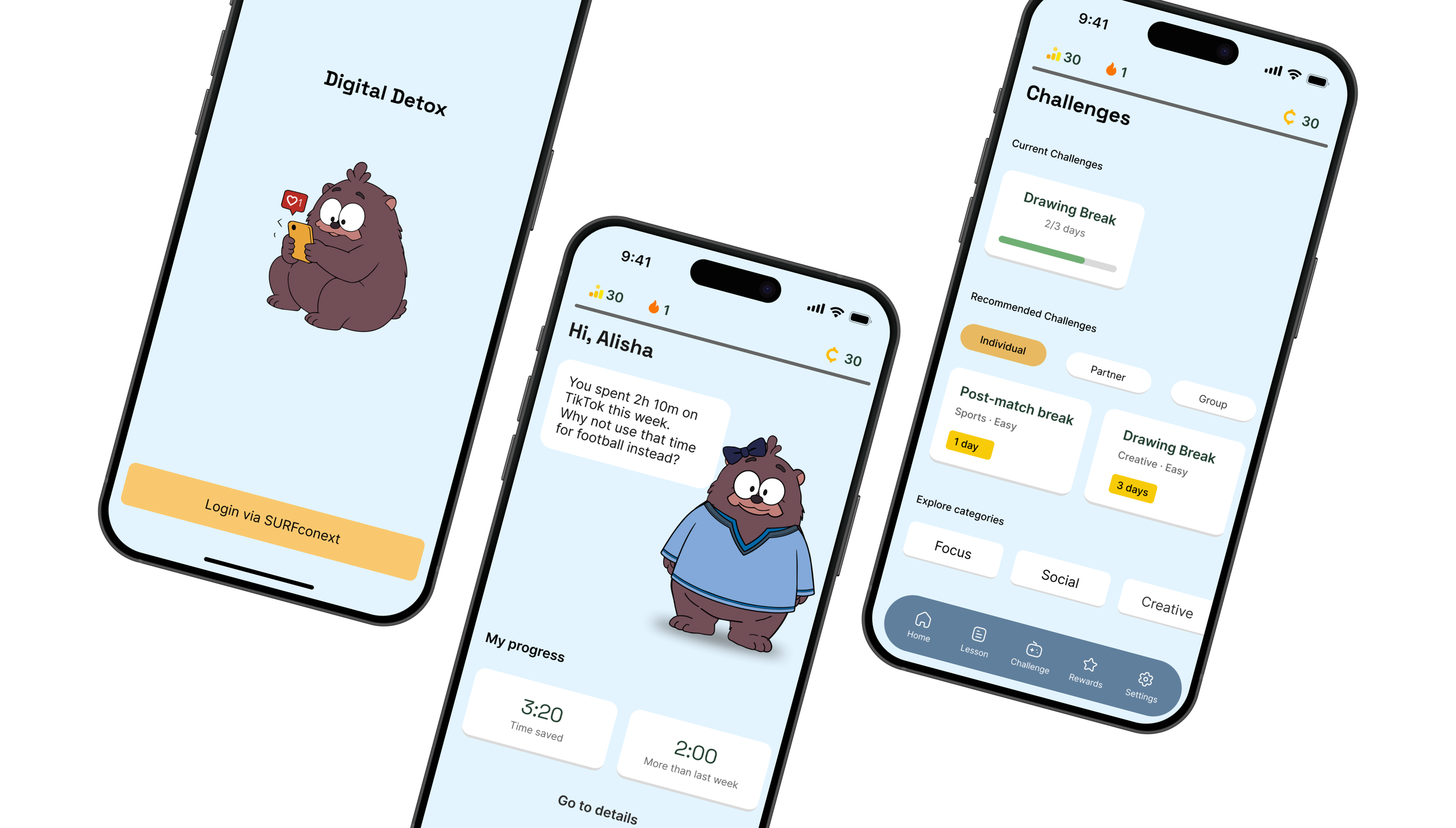
An app that nudges 15-19 year olds to reduce their screen time,
without making it feel like restriction.
Role
UX Researcher
UX/UI Designer
Team
UX/UI Designers ③
Illustrator ①
Timeline
6 weeks
Tools
Figma
Methods
Interviews (10)
COM-B analysis
Card sorting (9)
Usability testing (8)
Summary
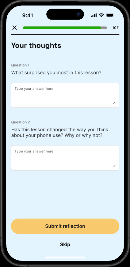
Card sorting showed students found reflection features among the least motivating, but our client, a teacher, required weekly reflection. I proposed making it optional, so he could still prompt students to reflect in class, while students using the app on their own could skip it.
→
→
→
→
Problem
Our client, a teacher at an MBO school in the Netherlands, wanted an app to help students become more aware of their screen time and build healthier habits as a class.
We interviewed 10 students at the client’s MBO school. One participant, P1, said her phone use felt “okay”, then checked mid-interview and found she’d already used it for 4 hours. It was only 11am. She wasn’t the exception. Other students described similar patterns, with screen time of 6 to 8 hours a day treated as normal among friends.
The problem wasn’t that students needed to be restricted. It was the gap between what they thought they were doing and what they actually did.
Findings
After the interviews, a teammate and I used the COM-B framework to make sense of the patterns we’d observed.
Physical restrictions, like requiring phones to be put away during class, worked short-term, but participants felt it took away their autonomy, and the effect didn’t last. Phone use for 6 to 8 hours a day didn’t raise concern among friends. Participants said they wouldn’t react to a friend’s heavy use, since their screen time was just as high (P3, P5). Yet when they were doing something they actually cared about, like football or time with people they were close to, their phone use dropped on its own. That pointed to the direction: not restriction, but something personal enough to matter and social enough to stick.
Conflict
9 card sorting sessions, run in person with physical cards, in Dutch.We tested which features would motivate students with a card sorting session: 9 students, 17 features, sorted into “would motivate me,” “neutral,” and “would not motivate me.” Discount codes, Levels, and Personal progress overview scored the highest. Reflection-based features, like Weekly reflection questions and Mood tracking, scored among the lowest. They required more time and effort from students than features like Discount Codes or Levels.
This created a conflict. Our client wanted students to reflect on their screen time every week. He wasn’t certain exactly when or how it should happen, but weekly reflection itself was a clear requirement.
I proposed making Weekly reflection optional. In his own classroom, he could still prompt students to reflect together as a class. For everyone else, reflecting stayed a choice. Mood tracking, which scored even lower and wasn’t something the client had asked for, we removed from the concept entirely.
Design Decisions
Reflection stayed optional
The lesson reflection kept a skip option next to the submit button. In the client’s own classroom, he could still prompt students through it together.
Challenges, built on
students’ own interests
COM-B showed that participants naturally cared less about their phones when doing something personally meaningful, like football or time with people they were close to. During onboarding, students shared what makes them put their phone down. I used those interests to write challenge copy that felt personal, not prescriptive.
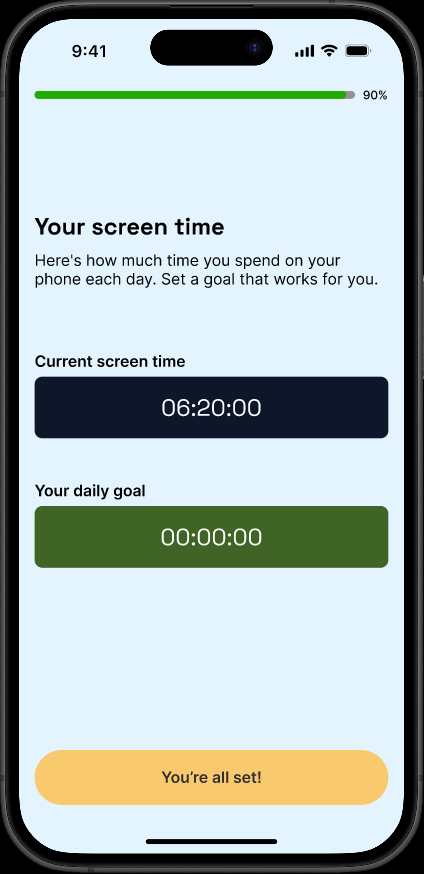
“Your daily goal”, not
“amount of reduction”
A teammate had changed ‘your daily goal’ to ‘amount of reduction.’ I changed it back. Our COM-B analysis showed us that autonomy mattered to participants.
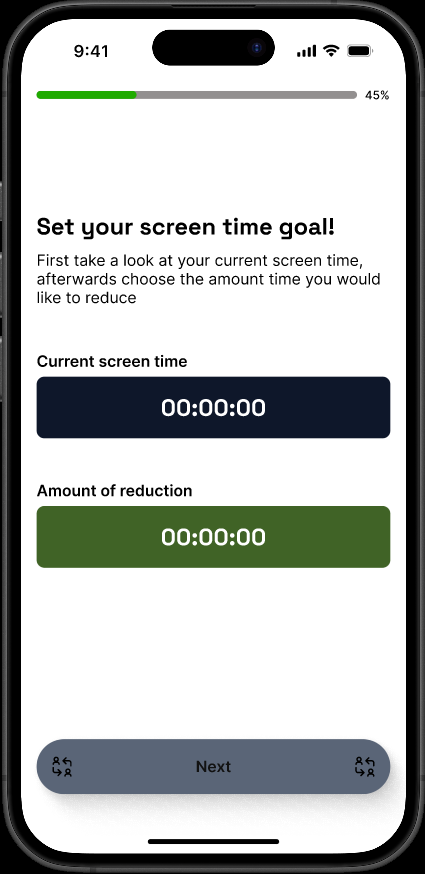
Teammate's version→
FinalI tested the high-fidelity prototype with 8 participants across 4 tasks. All 8 completed Tasks 1 to 3. Task 4 was completed by 7 of 8; P2 couldn’t find the My Progress Page.
Outcome
8/8
task completion rate
(Tasks 1- 3)
Results:
7/8
found My Progress
(Task 4)
82.8
SUS score
Industry average: 68In the debrief, I asked directly whether the app felt forced or restrictive. All 8 said no.
“Didn’t feel forced or restrictive,
they can control in the app.”
I asked this myself, as one of the app’s designers, so participants may have answered more positively.
The whole project started from one question: how do you get students to reduce screen time without it feeling like punishment? We couldn’t test whether screen time dropped. On whether it felt like punishment, this was the closest we had to an answer.
Reflection
Working across multiple research methods taught me to look for where they agreed and where they didn’t, and to use that tension to sharpen the reasoning behind a decision. Writing the actual copy was the first time I saw that reasoning turn into something concrete, word by word.
Next step
Improve navigation to My Progress, which one participant couldn’t find during testing
Measure whether screen time actually changes, by comparing students’ screen time over several weeks of use
Explore whether the app could extend beyond the original target group, as a few participants suggested during testing