Keyflow
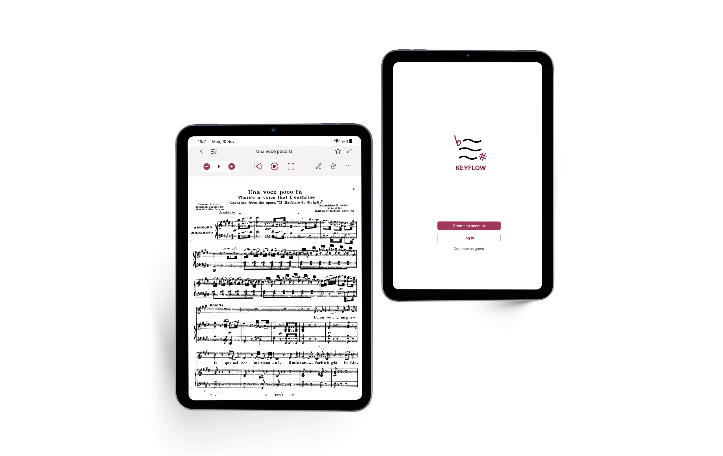
Designing a sheet music app around musicians’ practice workflow
Timeline
5 weeks
(non-continuous)
Tools
Figma
Team
Solo
(personal project)
Role
UX Researcher
UX/UI Designer
Summary
Goal: Find out whether the transposition problem I faced while studying classical voice was shared by other musicians.
Process: Interviews with 9 musicians showed it was shared, but only as one of several practice problems, like complex rhythms. Together with competitor analysis, this led me to broaden the scope to the whole practice workflow.
Outcome: A tablet practice app built around transposing and playback. 2 rounds of testing with 12 participants: 100% task completion, and task time down 37% on average from mid-fi to high-fi.
Research question
I had experienced how difficult transposing sheet music is while studying classical voice. I wanted to find out if it was specific to classical vocalists or shared by other musicians.
Research
To answer this, I interviewed 9 people in total to understand whether the transposition pain point I had experienced as a classical vocalist was shared by other musicians. After the interviews, I narrowed the target group to 5 participants (P1, P4, P5, P6, P8) who were more directly relevant to the research goal.
The other 4 were excluded for reasons specific to their instruments, playing style, or current role.Key findings:
5
needed to transpose
sheet music
/5
6.3
average frustration rate
/10
3
gave up on a piece due to transposition issues
/5
P1 rated their frustration with transposing as “laziness level 9.5.”
P5, on the time cost of finding a correctly transposed version: “Sometimes I bought one but it was just incorrect… so then the next day I had to find another one.”
To understand whether this was already being solved elsewhere, I compared 4 apps used by musicians.
Competitor Analysis
Transposition was a secondary feature in all 4 apps, never the main one
Free versions were generally too restrictive, with most core features behind a premium upgrade
Melody Scanner’s camera scan sends users to an external website, a potential drop-off point
Thematic Analysis
To bring the interview findings together, I applied thematic analysis to the data, coding it into several themes: emotions, barriers, context, behaviour, current method, and needs.
The clearest pattern came from Barriers and Current Method: frustration was driven not just by the time and cost involved, but by how much the difficulty depended on a piece’s popularity. None of the 5 participants’ actual solutions involved a dedicated transposition app. Instead, they relied on manual work, paid websites, or built-in device features.
The key insight from this analysis was that transposition was not only a practical problem, but created frustration and influenced how participants approached or abandoned pieces.
Pivot
The project began with a clear assumption: transposition was the main problem. Early interviews supported this, as all 5 participants needed it, with frustration averaging 6.3/10.
But the questions about practice habits revealed transposition wasn’t isolated. P1 described struggling with complicated rhythms and losing track of solo parts. P8 relied on bookmarks and described being a slow reader. Competitor research added another signal: apps like Newzik, which already combined ensemble and practice management, weakening the idea of transposition as an unclaimed feature.
I shifted focus from finding a feature no other app had to addressing the pain points the target group actually raised. The project evolved from “How might we help musicians maintain their flow while changing keys and turning pages?” to
“How might we reduce preparation friction within individual music practice workflows?”
Personas & Journey Maps
Personas were rebuilt from interview data, combining the 5 target participants into 2: Peter (mainly P1, academic and audition context) and Sara (mainly P6, theatre context)
Journey maps went from 3 assumed stages (before, while, after using the app) to 5 stages based on interview data
The new Practice stage showed that difficulties continued after the key was solved, like losing track of notes or page turns
The IA (Main Screen, Library, Settings) stayed largely the same. In the sheet viewer, Bookmark and Play were added and Edit Sheet was removed
User flows went from 3 to 2: practice and transpose now connect both ways instead of a fixed sequence, and a separate flow resumes previous practice
Information Architecture & User Flow
→
Design
Design decisions
Most of the original design decisions held up after the interviews and scope change, but some were revised, dropped, or added based on what the research showed.
Transpose remained the core feature. The key signature typically sits at the top left of a sheet, which likely draws attention there first, and this matched how consistently key changes came up as a pain point in interviews.
Transpose as primary action
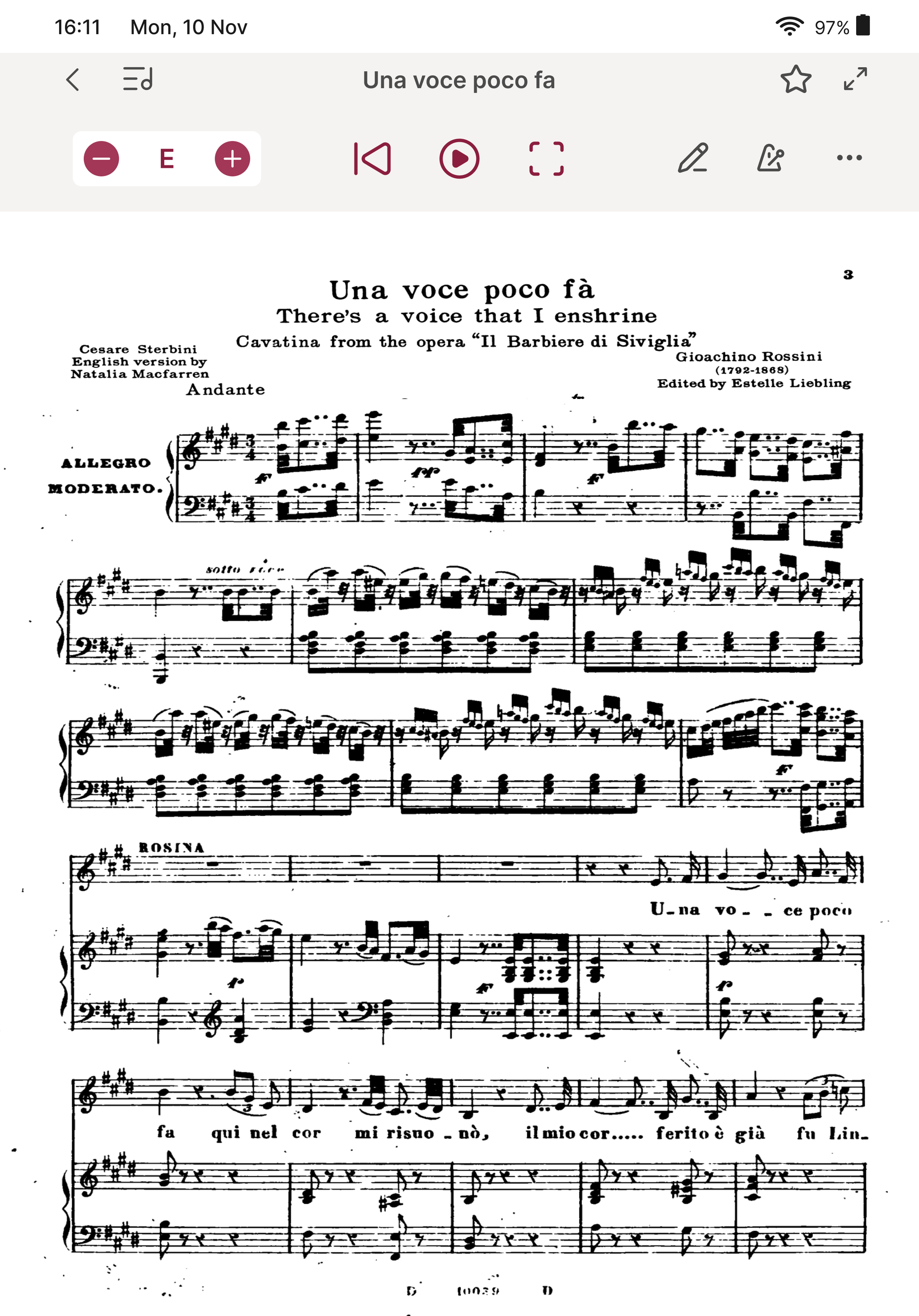
Play was originally a secondary function, like Metronome and Notes, but was elevated to the same priority as Transpose once the scope expanded. This wasn’t based on interview data directly, but on the reasoning that playback marks the start of the core practice activity, while annotation and bookmarking only support specific moments within it.
Play elevated to same priority
The app opens directly into uploading or scanning a sheet, skipping a home or dashboard screen. This matched interview data (Q14) on what musicians did first when opening the apps they already used: most went straight to finding or opening their own piece, rather than a management-style home screen.
No home screen
Edit sheet, including pen-based note recognition, was one of the ideas I was attached to. I went back to the data looking for a reason to keep it, and couldn’t find one. It was dropped.
Edit sheet removed
Direction: a classical concert hall look in burgundy and off-white. A design professor advised one clear focus instead of a broad audience. With limited time and test participants, and my background in classical voice, classical music was the practical choice
Colour: a 60-30-10 rule. 60% sheet music and off-white background, 30% text and UI, 10% burgundy, used only for Transpose and Play
Type: Inter, a geometric sans-serif, keeps the burgundy palette from feeling old-fashioned
Visual Design
Testing was conducted 2 rounds with 12 participants total: 6 for mid-fi (M1-M6) and 6 new participants for high-fi (H1-H6), at Prins Claus Conservatorium, Groningen.
Testing
Framework
Method: Moderated, task-based, think-aloud
Tasks: 2 (transposing a piece from E to F, finding a saved sheet)
Data: quantitative (time on task, errors) and qualitative(quotes)
Mid-fidelity
High-fidelity
Results:
Task 1 — Transposing
32.8s → 25s
Time
0.66 → 0.33
Error
Task 2 — Library
10.5s → 5.3s
Time
0.33 → 0
Error
Since mid-fi already showed 100% task completion and low error rates, most changes going into high-fi were refinements rather than structural redesigns. The key label was simplified from “EM” to just “E”, removing the Major/Minor distinction entirely. The library icon was redesigned based on confusion observed in mid-fi (M3 missed it, M6 suggested it look more like musical staff lines); this carried into high-fi without further issues.
The high-fi design was received positively across all 6 participants:
“Musician-friendly”
“Perfect, very clear,
it works”
“
A little colour, and there’s nothing changed about the sheet music. It’s really clear”
Transpose and Play as primary actions, an empty state instead of onboarding, and the stepper plus dropdown key selector caused no confusion in either round
All 6 high-fi participants found the saved sheet without errors, through the library icon or the back button. H6 suggested making the icon bigger
Supported
Limitations
Several changes were tested together, so the results can’t show which decision caused which improvement
Testing focused on the transpose and library flows. Since the scope expanded to the broader practice workflow, testing an actual practice session would give a fuller picture
Overall, pain points from the interviews led to specific design decisions, and both testing rounds suggest the research-to-design process held up in practice.
Reflection
Working on this project reinforced how easy it is to fall in love with an original idea. The hardest part wasn’t the design itself, but staying open to evidence that the initial direction needed to change.
Next step
Research and design how practice-flow interaction like annotation and playback actually work in a full session, and then test them together
Prototype and test a vocal range indicator, showing a piece’s highest and lowest notes, raised by one participant